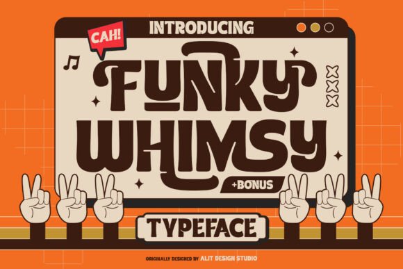
Funky Whimsy Typeface: Retro Charm That Works Online
It was 2 a.m., and I was tweaking the hero section of a new coaching website—clean layout, warm photography, strong value prop—but something felt flat. The headline just sat there, polite and predictable. So I swapped in Funky Whimsy. Instantly, the page exhaled. Not louder—lighter. Playful, yes, but also confident, intentional, full of quiet personality. That’s when I knew this wasn’t just another retro display font. It was a digital tone-setter.
A Display Font That Earns Its Space
Funky Whimsy is a premium display typeface designed by Alit Design Studio—and it wears its retro soul lightly. Think late-’60s optimism meets early-’80s graphic wit: bold letterforms with soft curves, uneven baselines that feel hand-drawn but never sloppy, and generous spacing that gives every word room to breathe. It’s not nostalgic wallpaper—it’s nostalgic intention. On screen, it holds up beautifully: high x-height, clear counters, and sturdy stroke contrast make it legible even at smaller display sizes (think 32–48px on desktop, 28–36px on mobile).
I tested it across real layouts: a boutique online store’s seasonal banner, a course sales page’s headline + subhead combo, a portfolio site’s “Work” section title, and a blog’s featured post header. In every case, Funky Whimsy created instant visual hierarchy—not by shouting, but by standing apart with warmth and character. It doesn’t compete with your imagery; it complements it, like a well-chosen frame.
How It Performs Where It Matters Most
Here’s what I learned after deploying Funky Whimsy across responsive breakpoints and real devices:
- Mobile-first? Yes—with caveats. At 28px on iOS Safari, it remains highly scannable over light or dark backgrounds. But avoid using it below 24px—even for decorative accents—unless you’re pairing it with ample negative space and high contrast.
- Image overlays? Surprisingly resilient. Over textured or busy photos, Funky Whimsy’s bold weight and open shapes kept text readable without heavy drop shadows. A subtle 1px text stroke (CSS
text-shadow: 0 0 2px rgba(0,0,0,0.5);) added polish on lighter images. - Buttons and CTAs? Best as secondary emphasis. I used it for “Get Your Free Guide” on a landing page—but paired it with a clean sans serif (Inter, set at 16px) for the button label itself. Why? Because Funky Whimsy shines brightest when it’s the *idea*, not the instruction.
- Dark mode? Thoughtfully balanced. No unexpected clipping or thinning. The font’s consistent stroke weight means it translates cleanly to both light and dark UI contexts—no manual adjustments needed.
Where Funky Whimsy Fits (and Where It Doesn’t)
This is a display font—full stop. It’s not meant for body copy, navigation menus, form fields, or data-dense dashboards. Trying to force it into those roles sacrifices both usability and brand clarity. But within its sweet spot? Magic.
I used it for:
- The main headline and section dividers on a digital brand kit landing page—reinforcing creative identity before users even scroll.
- A “Limited-Time Offer” banner on an online shop—adding urgency without aggression.
- Featured course titles in a learning platform dashboard—making each offering feel distinct and human, not algorithmic.
- Blog post headers on a wellness site—softening clinical topics with approachable typography.
What didn’t work? Using it for paragraph intros (too distracting), small footer links (low readability), or inline emphasis within body text (disrupted rhythm). Keep it reserved for moments where you want the viewer to pause, smile, and remember.
Smart Pairing Makes All the Difference
Funky Whimsy thrives in conversation—not isolation. My go-to pairing is Inter (a highly legible, variable sans serif) for all functional text: body copy, captions, buttons, and navigation. The contrast is effortless—Funky Whimsy brings voice; Inter brings clarity. For more editorial or luxury-leaning sites, I’ve paired it successfully with IBM Plex Serif—its gentle serifs echo Funky Whimsy’s organic curves without competing.
Avoid pairing it with other high-contrast display fonts or overly ornate scripts. Let Funky Whimsy be the standout. You’ll get stronger branding, cleaner hierarchy, and better user flow.
Practical Notes Before You Implement
Before dropping Funky Whimsy into your next project, check these details:
- Licensing: Confirm commercial web use is included—especially if embedding via @font-face or using it in client-facing SaaS or course platforms.
- File formats: Look for WOFF2 (smallest, best support) and WOFF (broad compatibility). Avoid relying solely on TTF/OTF for web.
- Weights & styles: Funky Whimsy is typically single-weight (Bold), which is perfect for display—but verify no italic or condensed variants exist unless you need them for specific design moments.
- Webfont loading: Load it asynchronously and set
font-display: swap;so fallback text appears quickly, then swaps in smoothly. - Accessibility: Always test contrast ratios (aim for 4.5:1 minimum against background) and ensure interactive elements retain sufficient size and spacing.
Funky Whimsy isn’t about turning your site into a time capsule. It’s about giving your digital presence a pulse—human, memorable, and quietly confident. When used with purpose, it doesn’t just say what you do. It says who you are.