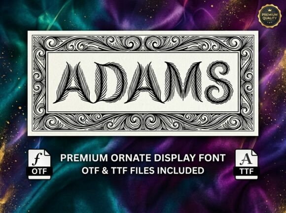
Adams: A Victorian Display Font That Elevates Digital Branding
Last week, I was finalizing the hero section for a boutique online store specializing in handcrafted ceramics—and that’s where Adams stepped in. Not as a placeholder, not as a last-minute swap, but as a deliberate, thoughtful choice. The client wanted “timeless elegance,” not just visual flair—and Adams delivered exactly that: a premium ornate display font rooted in Victorian craftsmanship, yet fully at home on modern screens.
What struck me first wasn’t just its bold letterforms—though those are undeniably rich—but how intentional each curve and serif felt. Adams isn’t decorative for decoration’s sake. Its high contrast, sharp terminals, and subtle flourishes create rhythm and gravitas. It reads like a carefully composed invitation—not a shout, but a confident, unhurried statement. That matters deeply when you’re asking someone to pause mid-scroll and consider a $240 stoneware vase or a limited-edition workshop series.
I tested Adams across real scenarios: over a muted linen-textured image banner (light text, dark overlay), as a headline above a product grid, and even as a subtle accent in an email header. In every case, it held attention without sacrificing clarity. Crucially, it didn’t compete with content—it framed it. That’s the hallmark of a strong display font: it supports hierarchy, not hijacks it.
Here’s where Adams shines most reliably:
- Hero section headlines — especially with generous line height and ample letter spacing (I used letter-spacing: .08em on desktop, tightening slightly on mobile)
- Landing page section titles — think “Our Process,” “The Collection,” or “Join the Workshop” — short, meaningful phrases where tone is as important as information
- Branded digital assets — social media banners, course sales pages, portfolio project thumbnails, and digital brand kits where consistency and distinctiveness reinforce recognition
- Logo lockups or wordmarks — particularly for creative studios, artisan brands, or editorial projects seeking refined, tactile authenticity
But let’s be practical: Adams isn’t meant for body copy, navigation labels, or button text under 16px. Its ornate structure demands breathing room. On mobile, I reserved it strictly for top-level headings—never below 24px—and always paired it with a highly legible sans serif (like Inter or Manrope) for all supporting text. That contrast works beautifully: Adams sets the mood; the sans serif delivers the message.
Readability checks were non-negotiable. On a dark background? I lightened the weight slightly and added subtle text shadow (text-shadow: 0 1px 2px rgba(0,0,0,.2)) to maintain edge definition. Over busy imagery? I applied a soft, semi-transparent overlay behind the text—not full opacity, just enough to lift the type off the texture. And yes—I tested it on iOS Safari and Chrome Android. No rendering hiccups, no missing glyphs. The webfont files loaded cleanly, and the variable version (when available) gave me smooth weight control without loading multiple static files.
Font pairing was intuitive, not complicated. For a coaching website I recently updated, Adams worked seamlessly with Lora for subheadings (a gentle serif bridge) and Open Sans for paragraphs—creating a layered, human-centered typographic system. For a minimalist product landing page? Straight to Inter Light for everything except the main headline. The key isn’t complexity—it’s contrast with purpose.
Before deploying Adams in any live project, I always verify three things: First, that the license covers web use (including e-commerce and SaaS platforms). Second, that the package includes at least Regular and Bold weights—some ornate fonts skimp here, but Adams delivers both with consistent metrics. Third, that multilingual support covers the client’s audience—even if it’s English-only now, having Latin Extended-A opens doors for future expansion without a font switch.
One unexpected win? Adams performed exceptionally well in email clients that support embedded webfonts (via @font-face in HTML email templates with graceful fallbacks). A small detail—but for a brand building direct relationships through newsletters, that extra touch of crafted typography strengthened perceived quality instantly.
It’s worth noting that Adams belongs firmly in the display font category—not a workhorse, but a signature. That means it thrives when used sparingly and meaningfully: a single headline per page, a logo treatment, a chapter title in a digital course guide. Overuse dulls its impact; restraint makes it memorable. I’ve seen clients try to stretch it into navigation or pricing tables—those attempts never land. But when used where it’s meant to shine? It transforms how users feel about a brand before they read a single sentence.
If you’re building a portfolio site for a fine artist, launching a slow-living blog, designing packaging for a small-batch tea brand, or crafting a campaign page for a heritage-inspired apparel line—Adams offers more than aesthetics. It brings intentionality, craft, and quiet authority to digital space. Not every project needs it. But when your brand values depth over speed, detail over distraction, and elegance over excess—Adams doesn’t just fit. It belongs.
And honestly? Watching a client smile when they see their homepage headline rendered in Adams—knowing that tiny typographic decision helped crystallize their entire brand voice—that’s why I still geek out over fonts.